Mangal database overview
This page is automatically generated from the mangal.io
database. It gives an overview, updated weekly, of the completeness of
sampling. The figures and data are generated through the use of github
actions, and reflect the most up to date state of the analysis. The work
flow file downloads the most recent version of the data, of the packages
used for the analysis, and of their dependencies, then generates the data
frames and figures, and pushes everything to this page.
The code to reproduce everything in this page is available at https://github.com/PoisotLab/MangalSamplingStatus.
These analyses were the basis of the following article (currently available as a preprint):
Environmental biases in the study of ecological networks at the planetary scale
Timothée Poisot, Gabriel Bergeron, Kevin Cazelles, Tad Dallas, Dominique Gravel, Andrew Macdonald, Benjamin Mercier, Clément Violet, Steve Vissault
bioRxiv 2020.01.27.921429; doi: https://doi.org/10.1101/2020.01.27.921429
Although the artifacts described in Data files can be used for
teaching or exploratory projects, we recommend starting from the database. A
Julia wrapper, Mangal.jl, is available for this
purpose.
Project organization
The master branch of the repository only stores the scripts (in scripts) and
a few helper functions (in lib), as well as the workflow. Everything else gets
generated weekly. The gh-pages branch has a copy of the figures (in figures)
and data (in data). All of the website material are in the dist folder,
which is written in during the build step, although the results are not
committed to the master branch.
Data files
This table summarizes the files that are generated at the various steps of the
pipeline. Steps 01 to 04 are about data collection, cleaning, and
integration, and steps 05 to 08 are about plotting and analysis. All of the
scripts can be downloaded from the master branch on github. The csv files
can be downloaded here directly.
| Output | Script | Description |
|---|---|---|
network_metadata.csv |
01_get_metadata.jl |
id, name, latitude, and longitude |
network_interactions.csv |
02_get_interactions.jl |
id, number of nodes, links, predation, parasitism, mutualism |
network_bioclim.csv |
03_get_bioclim.jl |
id, one column for each bioclim variable |
network_data.csv |
04_merge_data.jl |
merge of the three previous steps (main table used for the analysis) |
Figures
These figures are meant to convey information about the coverage of the database, either by adressing its temporal, spatial, or environmental components.
Overall state of the database
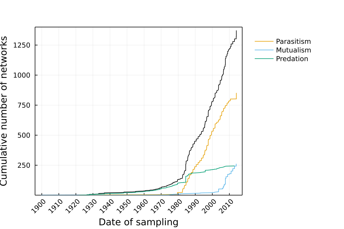
Growth over time
This represents the cumulative number of networks, either across the entire database, or for different types of interactions.
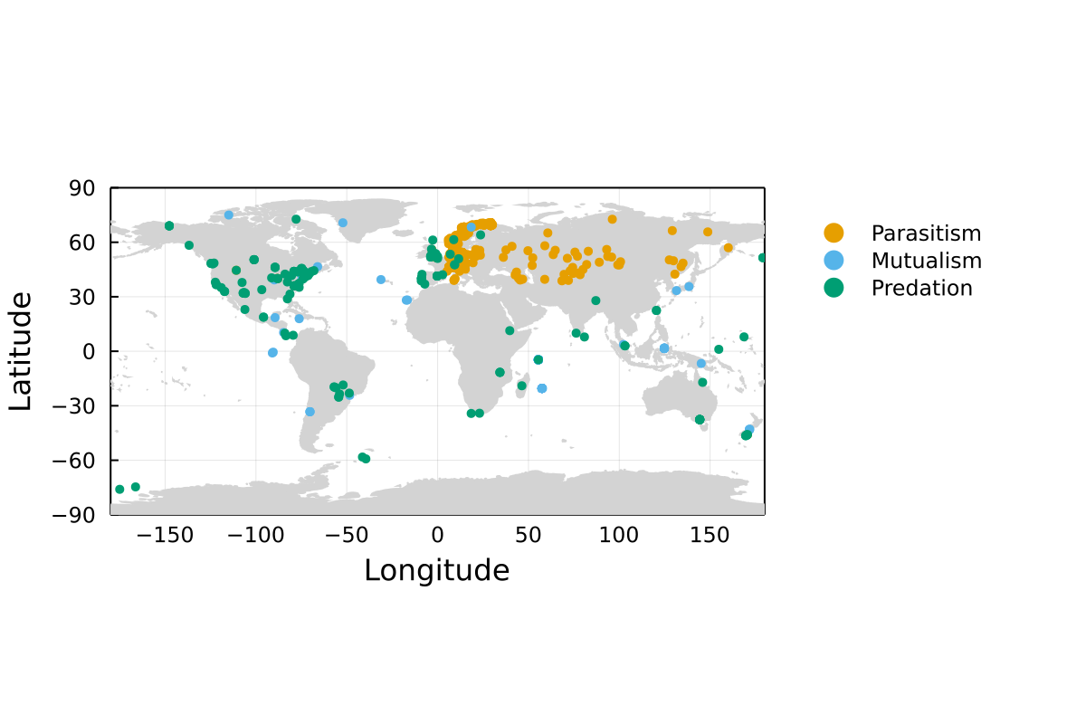
Map of networks
Each point is a single network. Note that some locations may have been re-sampled, or that some networks are so close to one another that they may not appear as different points in this map.
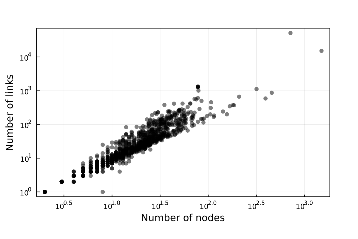
Link-Species relationship
This plots the number of links in relationship to the number of nodes.
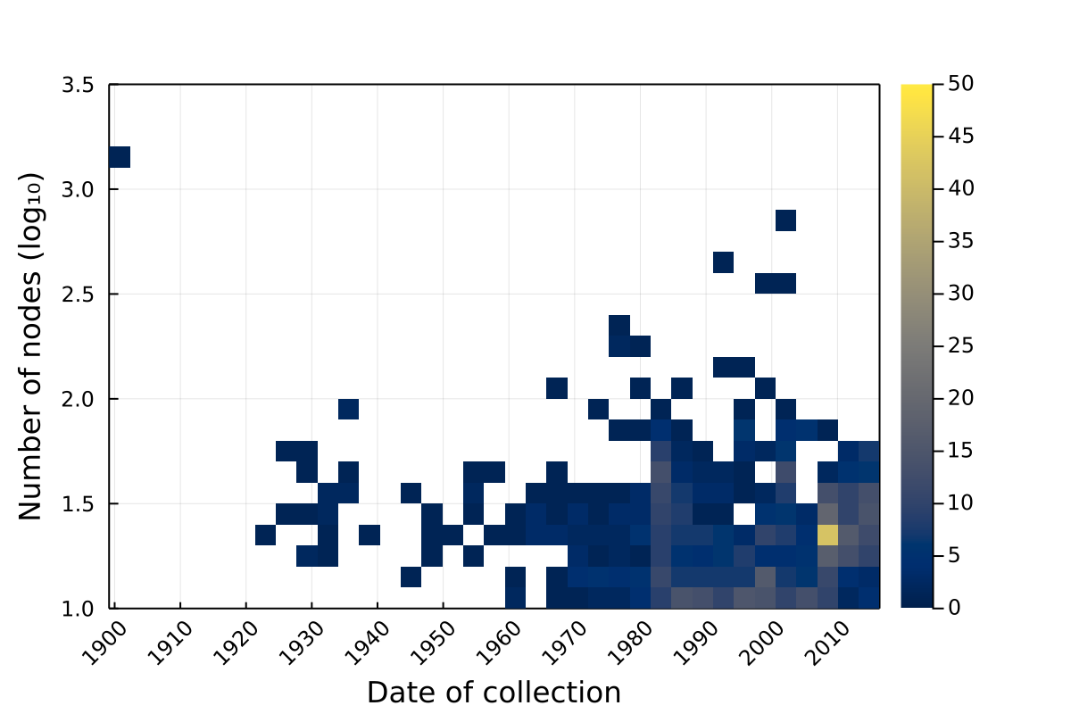
Properties over time
Networks across biomes
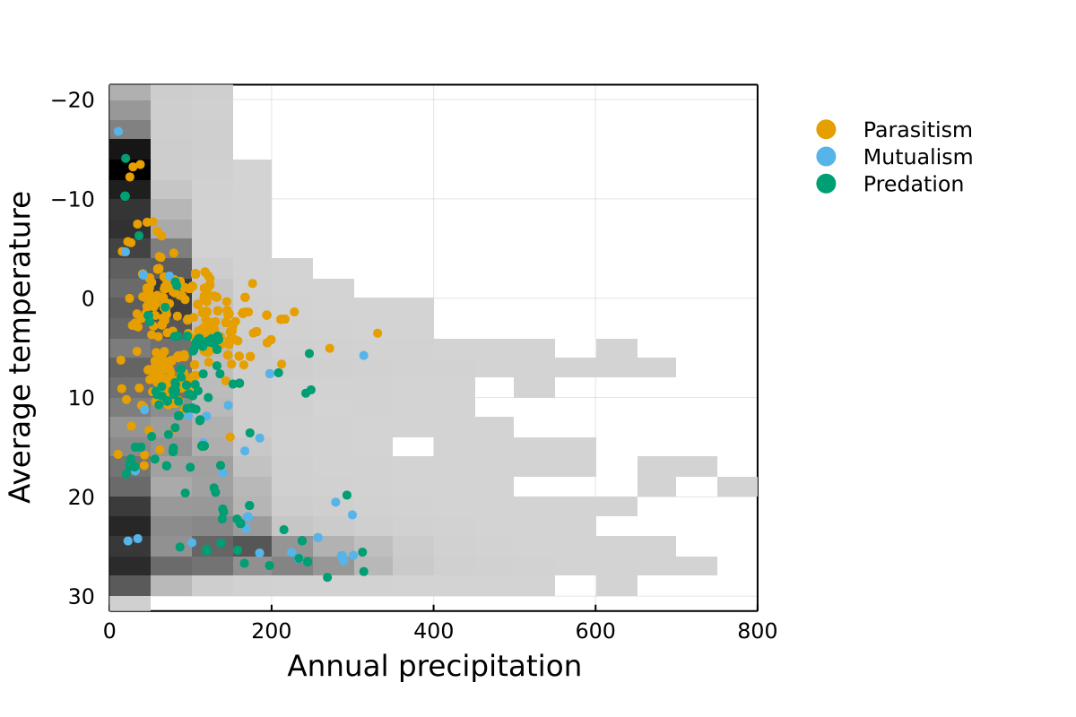
This is a mapping of networks on the environmental space defined by Whittaker. If the diversity of Earth’s biomes is well covered, we expect this figure to have points distributed uniformly in the lower-left triangle.
Geographical coverage of networks
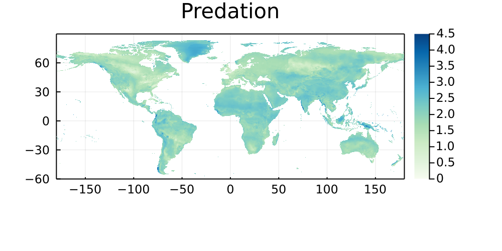
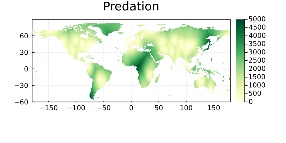
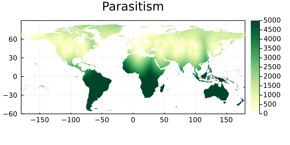
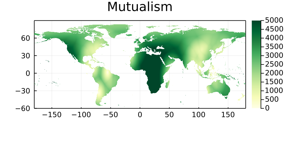
The following maps represent the great-arc distance (in km) between every pixel on Earth to its five closest networks, and are stratified by type of interaction. Areas that are paler have more networks, and darker areas are therefore good candidates for either sampling, or digitization of existing data.
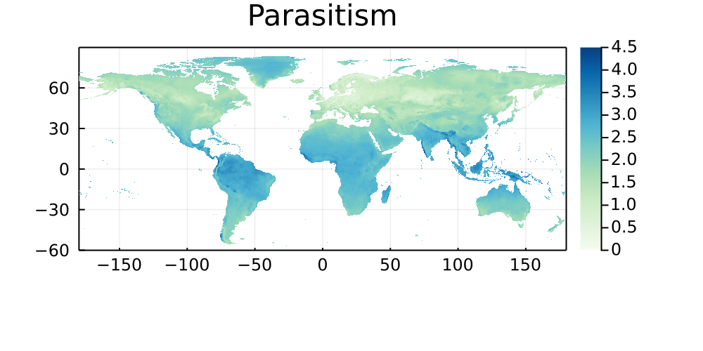
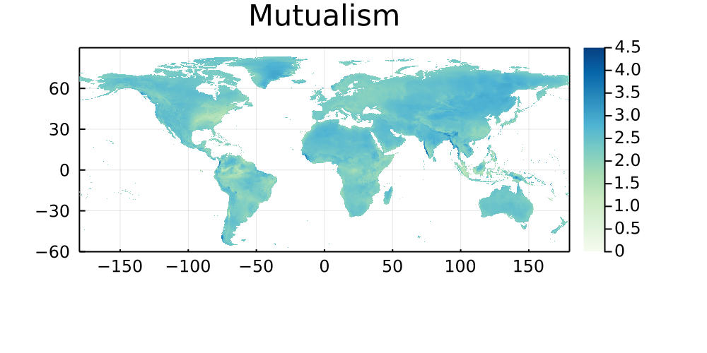
By similarity with the previous set of maps, this section shows the natural log of the Euclidean distance between every pixel on Earth and the bioclimatic conditions of its five closest neighbors in which a networks has been sampled. Areas that are darker do not have good climate analogues, and are therefore good candidates for either sampling, or digitization of existing data.
Predation
Parasitism
Mutualism
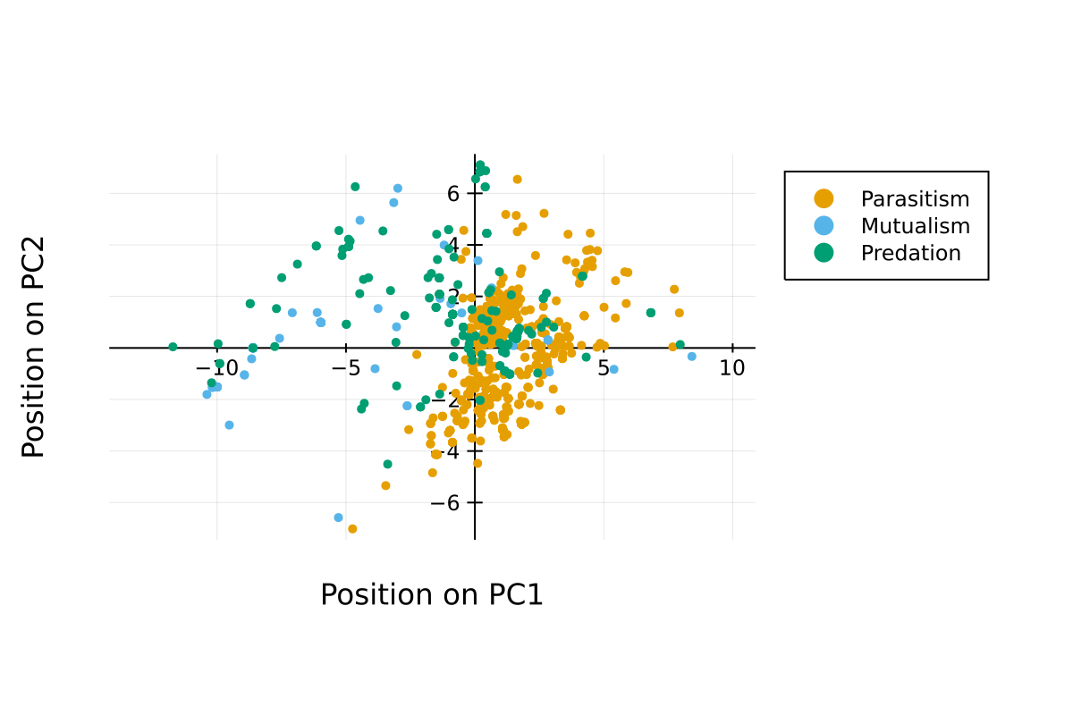
Originality of sampled environments
The following figures present the results of a Principal Component Analysis on the bioclim values of the networks in the database.
Principal component analysis
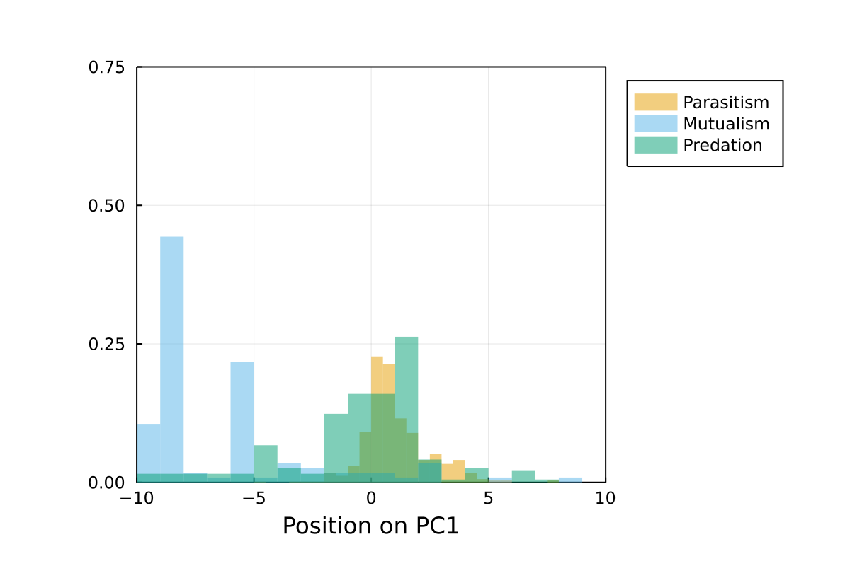
Position on PC1
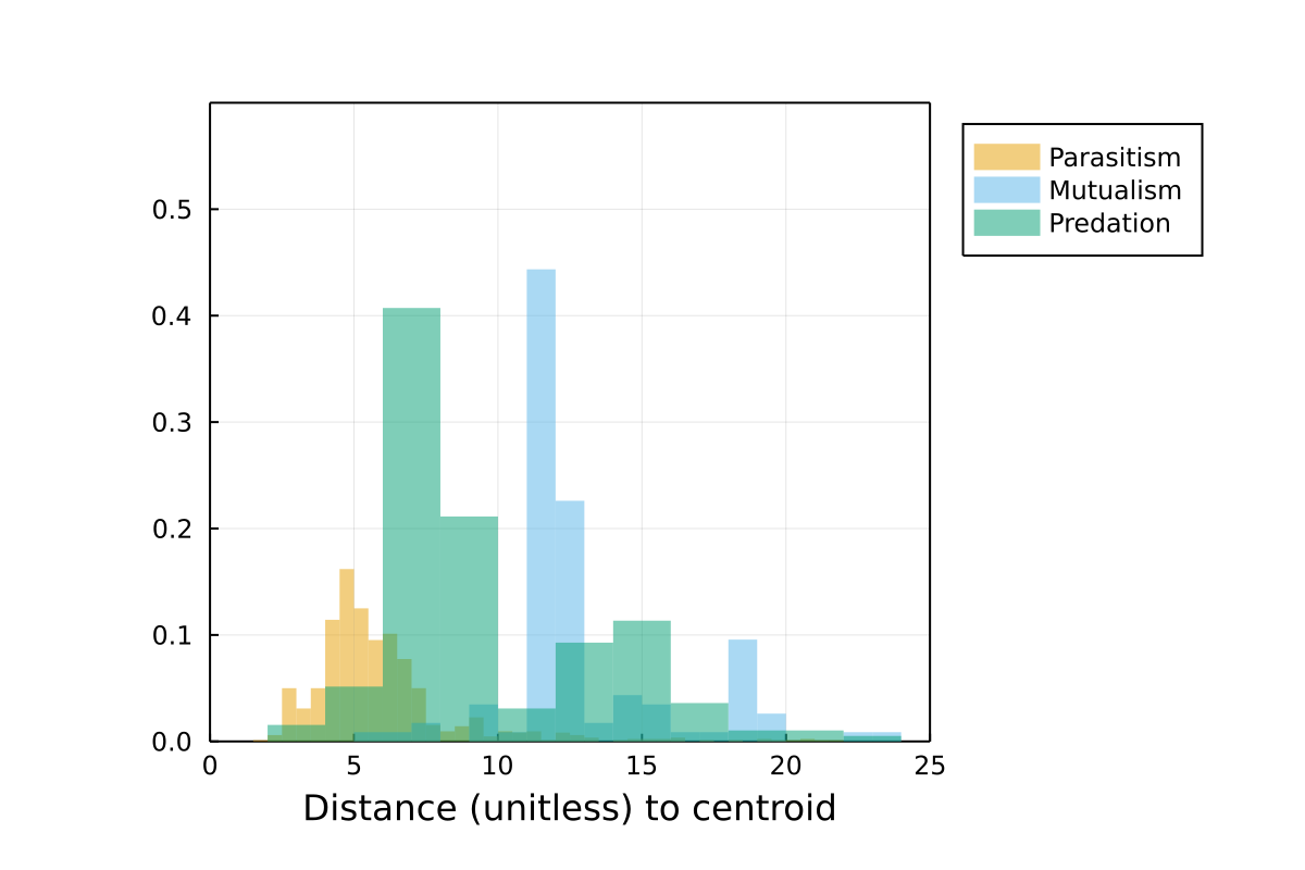
This is a representation of the position on the first axis. Networks with similar values have been sampled in similar environments.
Distance to centroid
This is the ranged distance to the centroid (so that the network sampled in the most unique environment has a value of 1) for all networks. Networks sampled in more distinct environments have higher values.