Interpretability
The purpose of this vignette is to show how to generate explanations from SDeMo models, using partial responses and Shapley values.
using SpeciesDistributionToolkit
using CairoMakie
using PrettyTables
We will work on the demo data:
X, y = SDeMo.__demodata()
sdm = SDM(ZScore, Logistic, X, y)
variables!(sdm, [1, 12])
hyperparameters!(classifier(sdm), :interactions, :self)
hyperparameters!(classifier(sdm), :η, 1e-4)
hyperparameters!(classifier(sdm), :epochs, 10_000)
train!(sdm)
ZScore → Logistic → P(x) ≥ 0.315We start by generating a partial response curve:
prx, pry = partialresponse(sdm, 1, LinRange(5.0, 15.0, 100); threshold = false);Note that we use threshold=false to make sure that we look at the score that is returned by the classifier, and not the thresholded version (i.e. presence/absence).
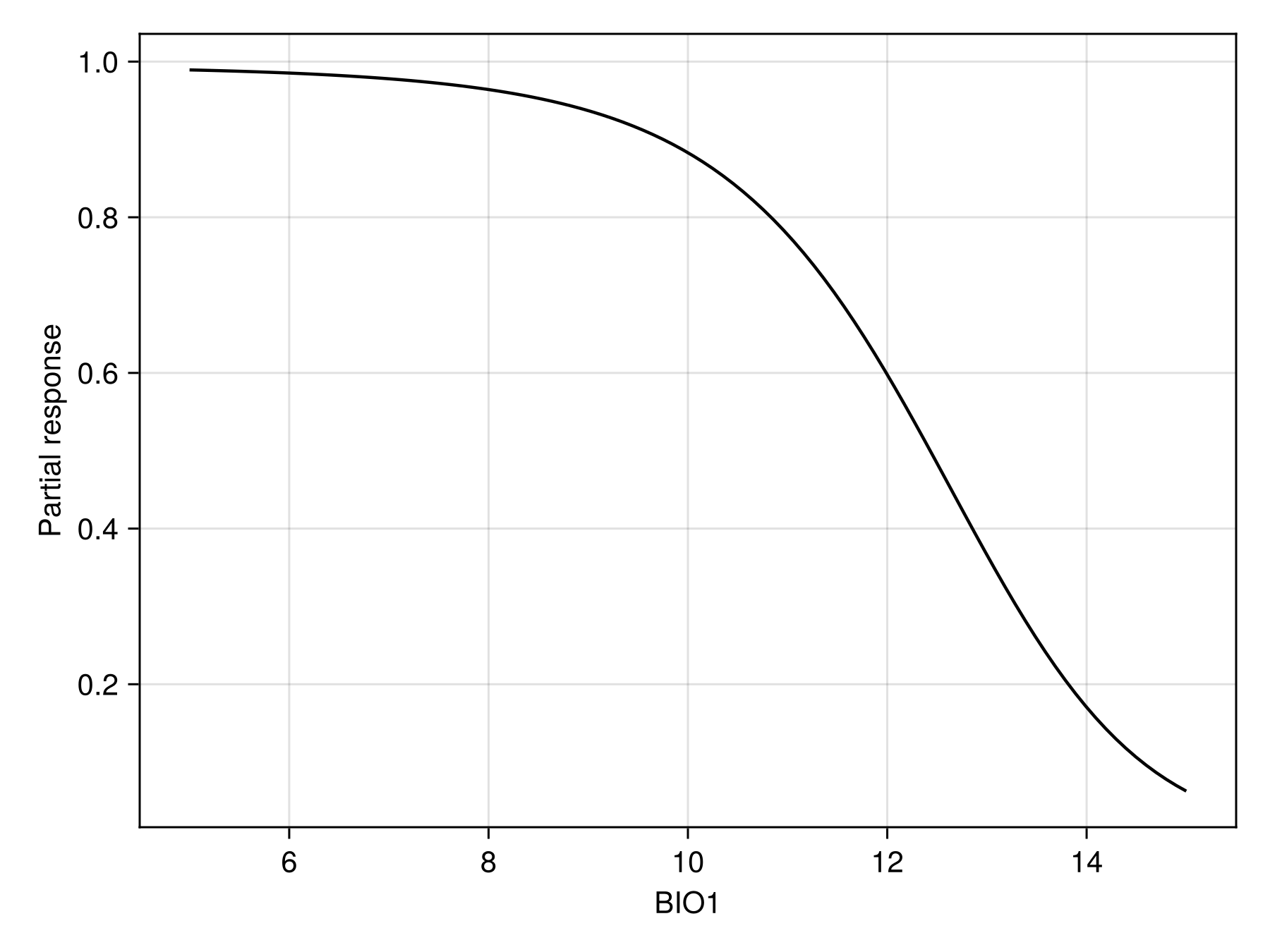
Code for the figure
f = Figure()
ax = Axis(f[1, 1]; xlabel = "BIO1", ylabel = "Partial response")
lines!(ax, prx, pry; color = :black)
We can also show the response surface using two variables:
prx, pry, prz = partialresponse(sdm, variables(sdm)[1:2]..., (50, 50); threshold = false);Note that the last element returned in this case is a two-dimensional array, as it makes sense to visualize the result as a heatmap. Although the idea of a the partial response curves generalizes to more than two dimensions, it is not supported by the package.
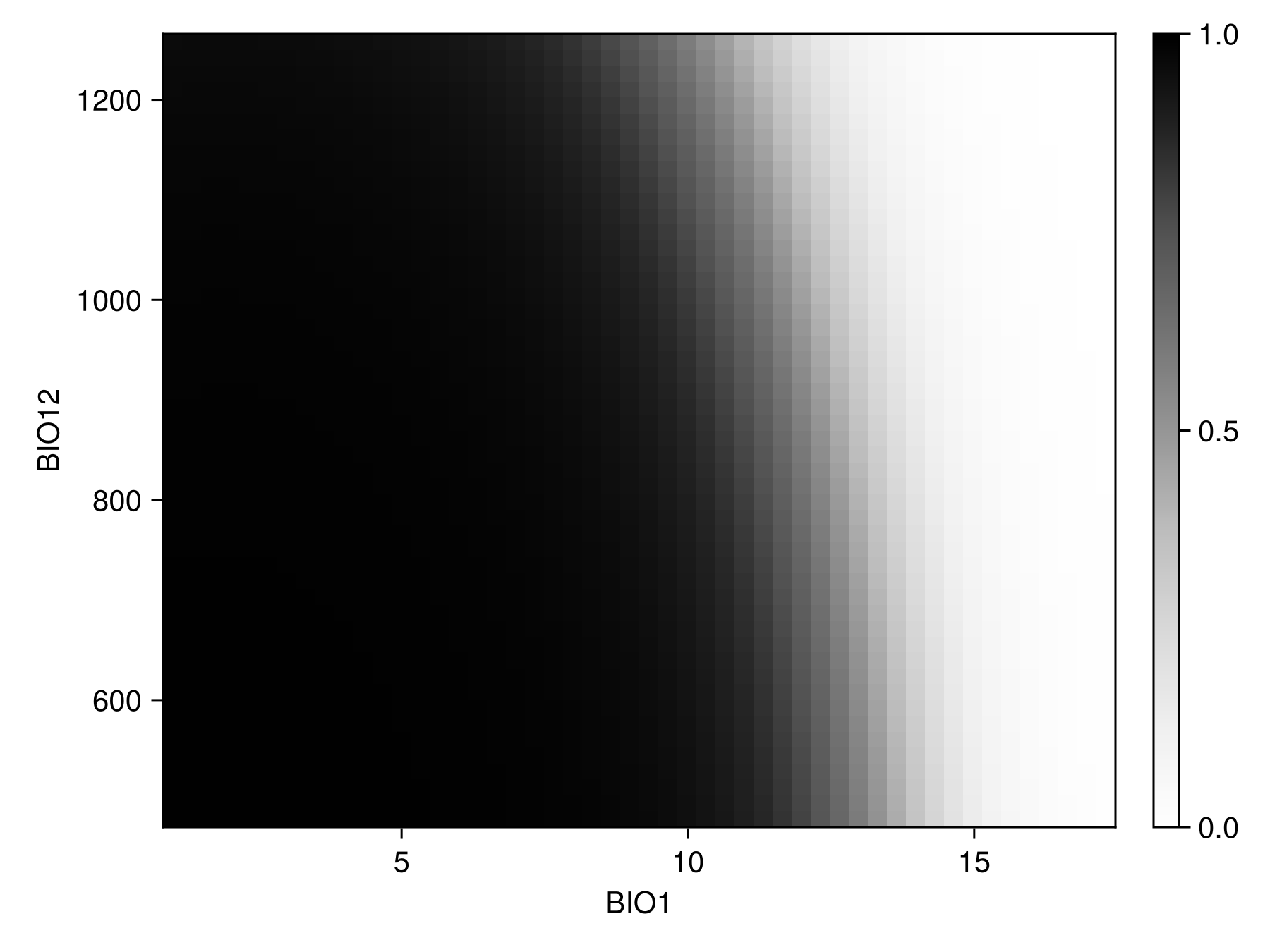
Code for the figure
f = Figure()
ax = Axis(f[1, 1]; xlabel = "BIO$(variables(sdm)[1])", ylabel = "BIO$(variables(sdm)[2])")
cm = heatmap!(prx, pry, prz; colormap = :Greys, colorrange = (0, 1))
Colorbar(f[1, 2], cm)
Inflated partial responses replace the average value by other values drawn from different quantiles of the variables:
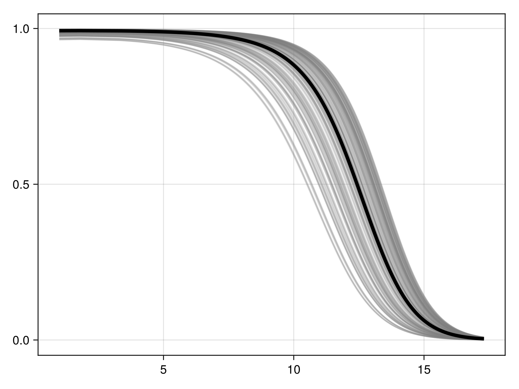
Code for the figure
f = Figure()
ax = Axis(f[1, 1])
prx, pry = partialresponse(sdm, 1; inflated = false, threshold = false)
for i in 1:200
    ix, iy = partialresponse(sdm, 1; inflated = true, threshold = false)
    lines!(ax, ix, iy; color = (:grey, 0.2))
end
lines!(ax, prx, pry; color = :black, linewidth = 4)
We can perform the (MCMC version of) Shapley values measurement, using the explain method:
[explain(sdm, v; observation = 3, threshold = false) for v in variables(sdm)]2-element Vector{Float64}:
-0.36071835679425546
0.0003793429916604289These values are returned as the effect of this variable's value on the average prediction for this observation.
We can also produce a figure that looks like the partial response curve, by showing the effect on a variable on each training instance:
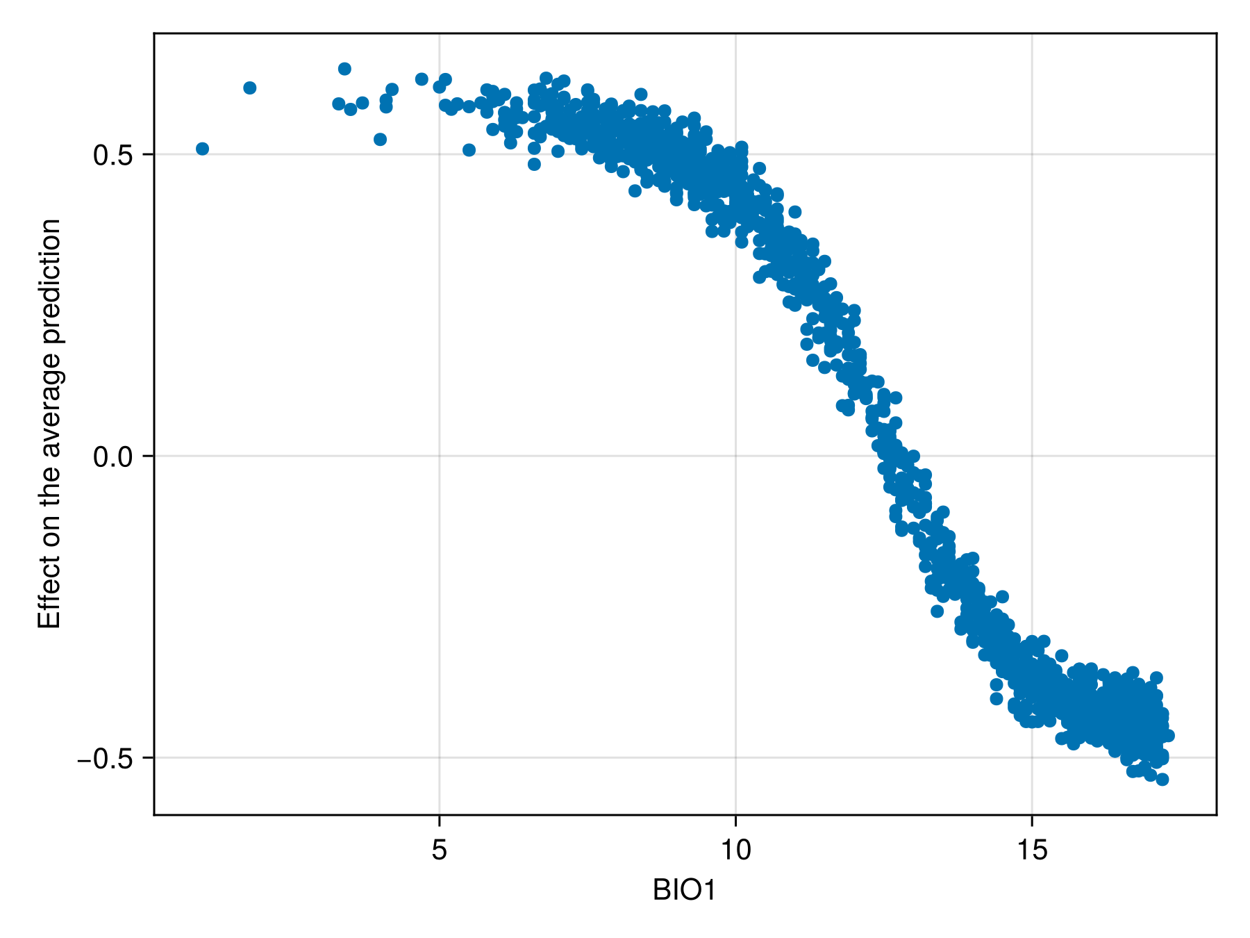
Code for the figure
f = Figure()
ax = Axis(f[1, 1]; xlabel = "BIO1", ylabel = "Effect on the average prediction")
scatter!(ax, features(sdm, 1), explain(sdm, 1; threshold = false))