Statistics on layers
The purpose of this vignette is to demonstrate how we can use common statistical functions on layers.
using SpeciesDistributionToolkit
using CairoMakie
using Statistics
import StatsBase
In this tutorial, we will have a look at the ways to transform layers and apply some functions from Statistics. As an illustration, we will produce a map of suitability for Sitta whiteheadi based on temperature and precipitation. As with other vignettes, we will define a bounding box encompassing out region of interest:
spatial_extent = (left = 8.412, bottom = 41.325, right = 9.662, top = 43.060)(left = 8.412, bottom = 41.325, right = 9.662, top = 43.06)We will get our layers from CHELSA1. Because these layers are returned as UInt16, we multiply them by a float to get Float64 layers.
dataprovider = RasterData(CHELSA1, BioClim)
temperature = 0.1SDMLayer(dataprovider; layer = "BIO1", spatial_extent...)
precipitation = 1.0SDMLayer(dataprovider; layer = "BIO12", spatial_extent...)
SDM Layer with 14432 Float64 cells
Proj string: +proj=longlat +datum=WGS84 +no_defs
Grid size: (209, 151)A large number of functions from Statistics have overloads to be applied directly to the layers. We can get the mean temperature:
mean(temperature)13.537673226163962Likewise, we can get the standard deviation:
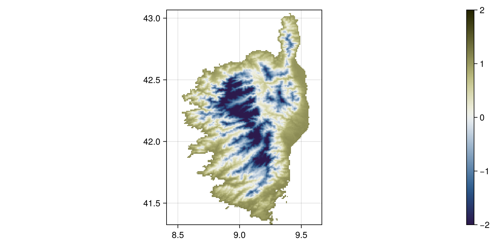
std(temperature)3.18348206205476Because of the way layers support arithmetic operations, we can esasily get the z-score of temperature as a layer:
z_temperature = (temperature - mean(temperature)) / std(temperature)SDM Layer with 14432 Float64 cells
Proj string: +proj=longlat +datum=WGS84 +no_defs
Grid size: (209, 151)This can be plotted. Note that we do not need to do anything on the layer itself, since the package comes pre-loaded with Makie recipes. This will be very useful when we start using GeoMakie axes to incorporate projections into our figures (which we will not do here...).
Code for the figure
fig, ax, hm = heatmap(
z_temperature;
colormap = :broc,
colorrange = (-2, 2),
figure = (; size = (800, 400)),
axis = (; aspect = DataAspect()),
)
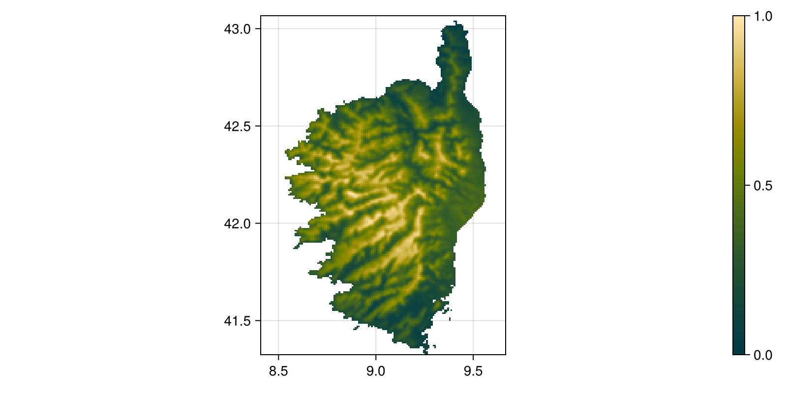
Colorbar(fig[:, end + 1], hm)Another option to modify the layers is to use the rescale method. When given two values, it will rescale the layer to be between these two values. This is useful if you want to bring a series of arbitrary values to some interval. As before, note that we can directly pass the GBIF object to scatter to show it on a map:
Code for the figure
fig, ax, hm = heatmap(
rescale(precipitation, (0.0, 1.0));
colormap = :bamako,
figure = (; size = (800, 400)),
axis = (; aspect = DataAspect()),
)
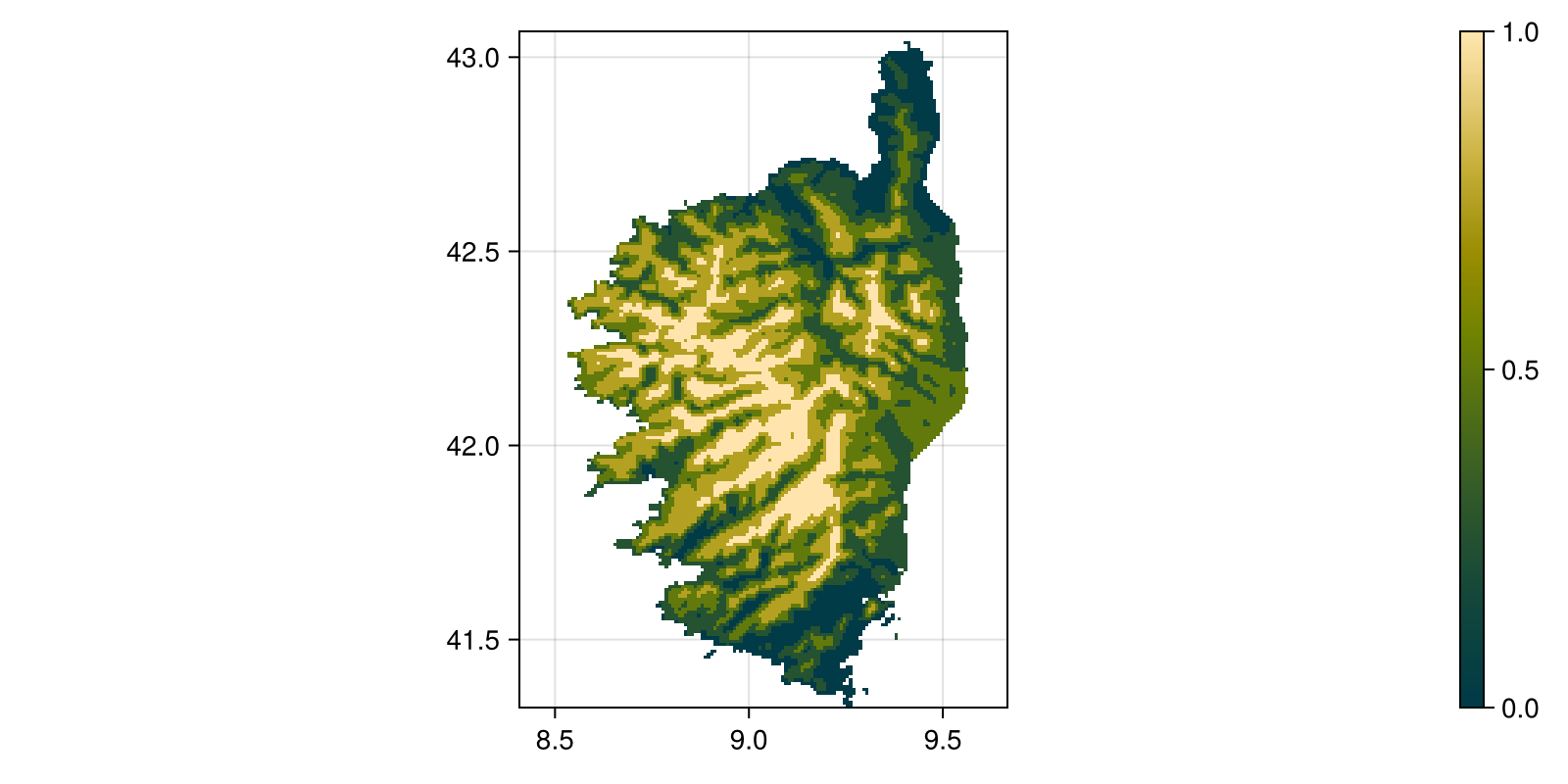
Colorbar(fig[:, end + 1], hm)To get a little more insights about the distribution of precipitation, we can look at the quantiles, given by the quantize function:
Code for the figure
fig, ax, hm = heatmap(
    quantize(precipitation, 5);
    colormap = :bamako,
    figure = (; size = (800, 400)),
    axis = (; aspect = DataAspect()),
)
Colorbar(fig[:, end + 1], hm)
The quantile function also has an overload, and so we can get the 5th and 95th percentiles of the distribution in the layer:
quantile(temperature, [0.05, 0.95])2-element Vector{Float64}:
7.055000000000007
17.0